This Paris Apartment by Laura González Reveals Why She’s a Rising Design Star
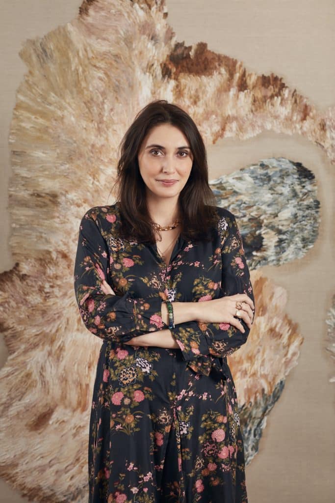
MARCH 21, 2021Since setting up her own firm, Pravda, at the age of 24 in 2004, the Paris-based interior designer LAURA GONZÁLEZ has made a name for herself with a host of hospitality and retail projects infused with whimsy and spiked with a touch of daring. These include the renovations, in Paris, of the Relais Christine hotel and the mythic Lapérouse restaurant, which originally opened in 1766; a CHRISTIAN LOUBOUTIN store in Barcelona; and CARTIER boutiques in Zurich, Stockholm and Madrid, as well as the jewelry house’s Manhattan flagship, due to be completed next year.
Her residential commissions have been far rarer. “I only accept them when I have a real aesthetic synthesis with the client and it’s possible to push the envelope a little,” the lively and swift-talking González explains. Such was the case with one recent project: the redesign and decoration of a 2,700-square-foot apartment in an outstanding ART DECO building in Paris’s 16th arrondissement.
“I’ve always liked the Art Deco period, especially in the way it revolutionized the layouts of apartments,” González says, describing the commission’s appeal. “This flat has an extraordinary layout centered on a majestic hallway.”
The apartment’s former owners were obviously less enamored with the 1920s–’30s style, because they added lots of ersatz 19th-century moldings to the walls and ceilings. González stripped these out and proceeded to imbue the flat with a pleasantly nebulous atmosphere.
“The wall color is neither white nor cream,” she states. “I call it butter. It gives a very poetic and peaceful note to an interior.”
She also incorporated numerous items from HER RECENTLY LAUNCHED FURNITURE LINE, whose various pieces, she recounts, “were designed in a completely sporadic fashion, rather than with the intent of creating a collection.”
The SOHO ARMCHAIR, with its wavy back, has echoes of the 1970s, while the Madras chair draws its inspiration from traditional Indian beds. The most distinctive item is probably the onyx and Lucite BACKGAMMON TABLE, created for the 2018 AD Intérieurs showhouse in Paris. “It’s something that’s in my DNA because my father was a casino manager,” González says.
Here, she takes Introspective on a tour of the apartment, noting how she integrated a mix of vintage and contemporary pieces from around the globe with items of her own design.
Entry Hall
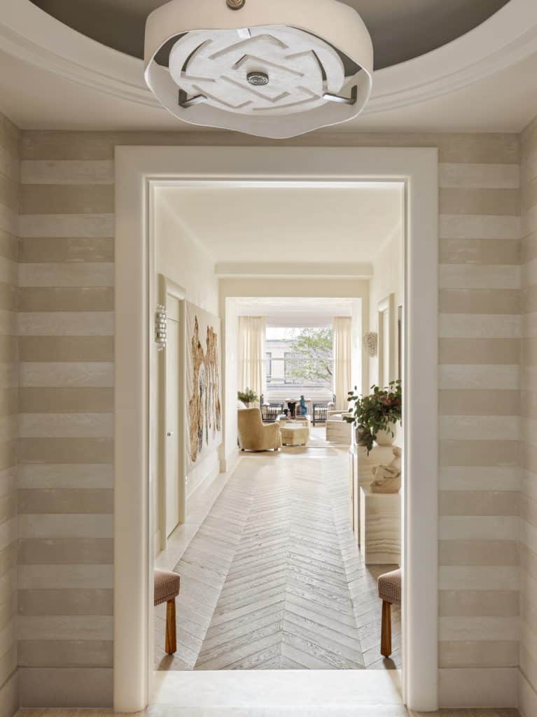
Among González’s major architectural additions were Art Deco–style door frames with gently rounded edges. “They help to structure the space and also bring a certain softness,” she says. “People often want to caress them. I wanted them to look like raw plaster, but the material itself is actually not very beautiful.
So, I re-created its chalky effect with marble powder instead.” The horizontal plaster stripes on the walls, meanwhile, are meant to evoke Greco-Roman architecture. González had trouble sourcing a chandelier for the space. So, she commissioned one from the Paris-based designer Patrice Dangel, who came up with a bronze and plaster model she describes as “a contemporary nod to the work of Jean-Michel Frank.”
Sitting Room
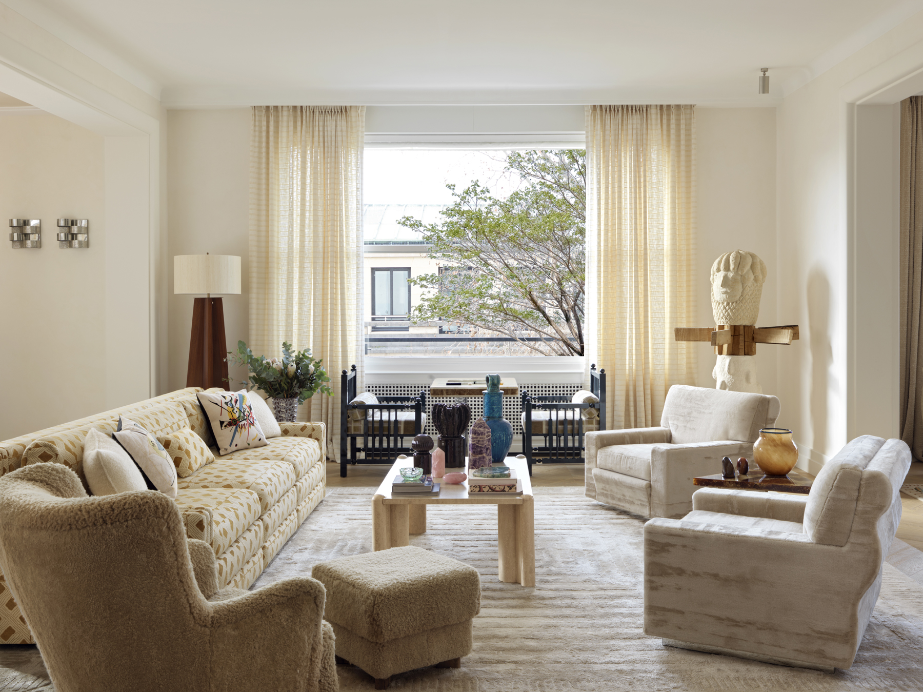
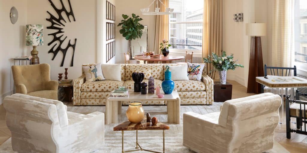
The foyer leads to the sitting room, occupying the middle of a large open-plan living area. “My aim was for this space to feel like a continuation of the entry hall,” says González. “When you avoid using contrasts, it opens up perspectives and gives a quite unbelievable impression of grandeur.”
With that in mind, she employed the same buttery tones as in the entry and then arrayed the space with numerous pieces from her own collection, including a pair of those Soho armchairs, the backgammon table, which are flanked by two Madras chairs, a series of CANDLEHOLDERS from her Natural Light series and a boxy SALVADORE SOFA. “I like the idea of getting back to rectilinear settees,” she says. “They really help to structure a room.”
Next, she mixed her own creations with a host of other objects, such as a totem-like sculpture by LAURENT DUFOUR, a 1960s travertine coffee table and a 1970s BRUTALIST WALL SCULPTURE by Belgian designer WILLY CEYSENS.
“I’m not at all a MINIMALIST,” González states. “I’m very attached to objects. I think they help to define the personality of an interior.”
Helping to give this space character is a 1950s Danish Louis Zwicki piano, bought from FURNIP, which González placed against a wall behind one of the Soho armchairs. “It’s quite special, in that it’s smaller than usual and has fewer keys,” she says. “Plus, it’s in rosewood, which is such a magnificent wood.”
In true González fashion, she placed at the instrument a PINK RESIN TRIO STOOL from her own collection. She compares the piece to “a tube of toothpaste or a large candy,” explaining that “it personifies the quirky, laid-back and colorful spirit I love. You should never take yourself too seriously.”
Dining Room
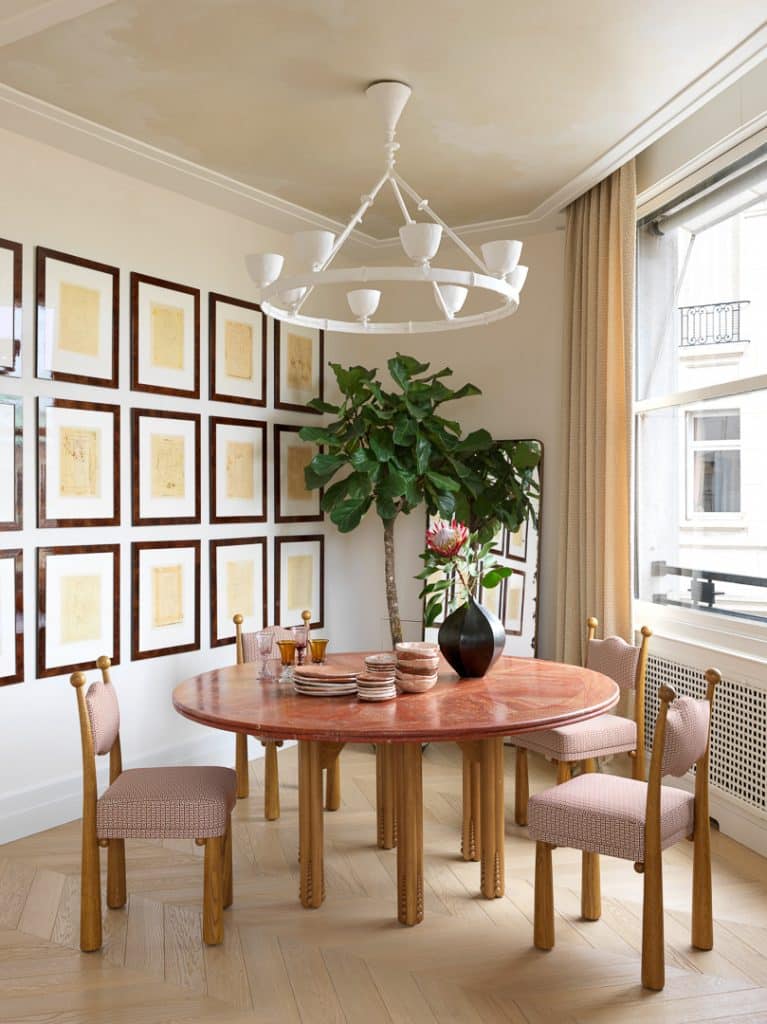
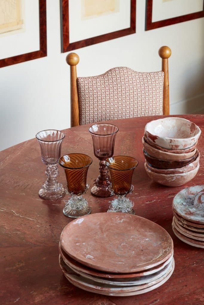
Situated to one side of the sitting room, the dining room has as its focal point the latest addition to González’s furniture collection: the OCTOPUS TABLE, composed of a Persian red travertine top set on tentacle-like oak legs carved with a series of small balls running up from their feet.
Similar spheres can be found on the MAWU CHAIRS, also of González’s design, that surround the table. “They are a little like an updated version of an Alpine chalet chair — but with a twist,” she says of the seats.
On top of the table is glassware from the 300-year-old Majorca-based producer Gordiola and a set of dishware that González commissioned from the young French ceramist Suzie Lapierre d’Argy, of FORMA. The set’s pieces, she notes, “are completely uneven, so you can really feel the work of the hand.”
The wall is decorated with a series of female nude drawings by the Liechtenstein-born artist Manolo Valdès. A DIEGO GIACOMETTI–like plaster chandelier hangs from the ceiling, which was painted with a subtle cloud motif by Atelier Roma.
“I often use skies on ceilings,” says González, “but never in gray, because there’s nothing worse than a rain cloud, or in blue, because that’s too classical and twee. I prefer using beige and white, which is more contemporary.”
Family Room
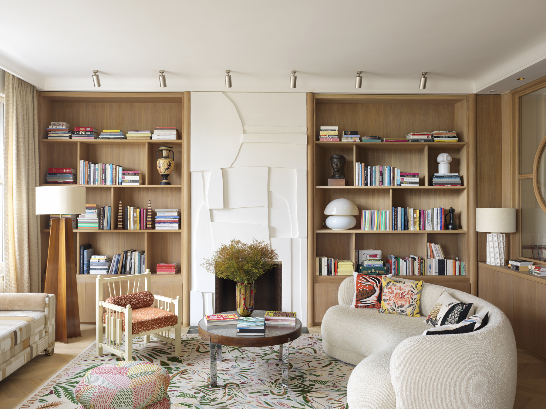
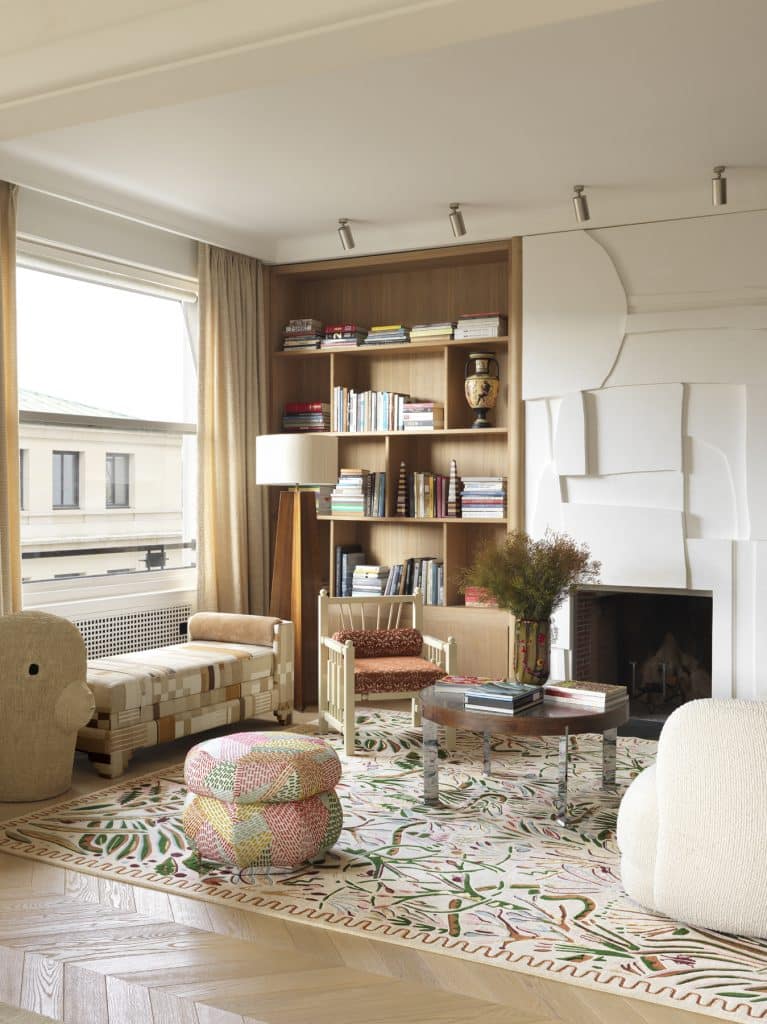
Located on the other side of the sitting room, this space is centered on a custom plaster fireplace created by François Mascarello, with whom González regularly collaborates.
“He’s an artist with multiple talents and who works in a number of different media,” she says. “His creations have a very BRUTALIST, fragmented character that I like a lot.”
More of her own designs — the curvaceous FUJI SOFA, another Madras chair and a multihued BYZANCE OTTOMAN — surround a stainless-steel and wood 1960s coffee table in the style of HEINZ LILIENTHAL, acquired from ORIGINAL IN BERLIN. They all stand on a rug imagined by the young French illustrator and textile designer MARGUERITE LE MAIRE.
“Its spare, wave-like border motif has an Art Deco touch, while the rest of its pattern is very abundant,” says González. “It brings something very fresh to the room.”
By the window is another Laurent Dufour sculpture, standing next to a daybed from González’s collection that’s adorned with a patchwork of fabrics from DEDAR. “I love pieces that are completely upholstered, even the feet,” she says. “It’s something that was common in the nineteenth century and that I like reviving with contemporary fabrics.”
Kitchen
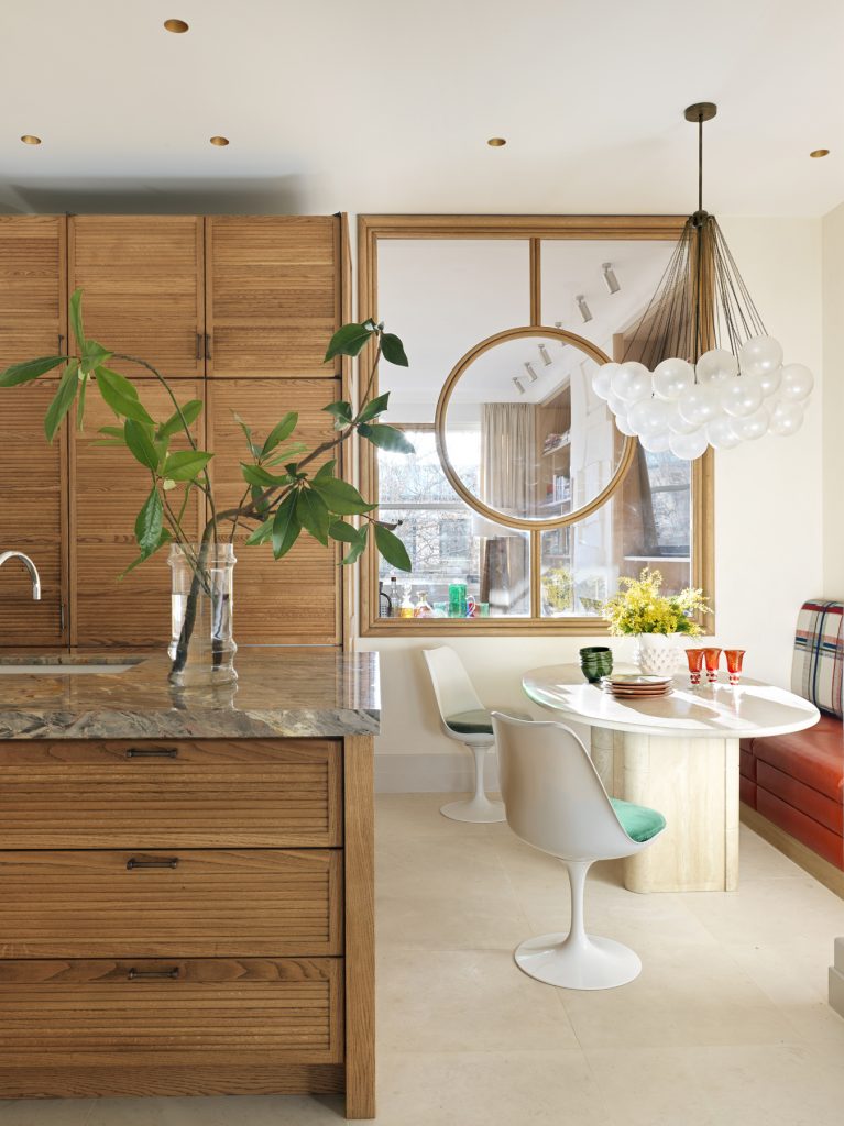
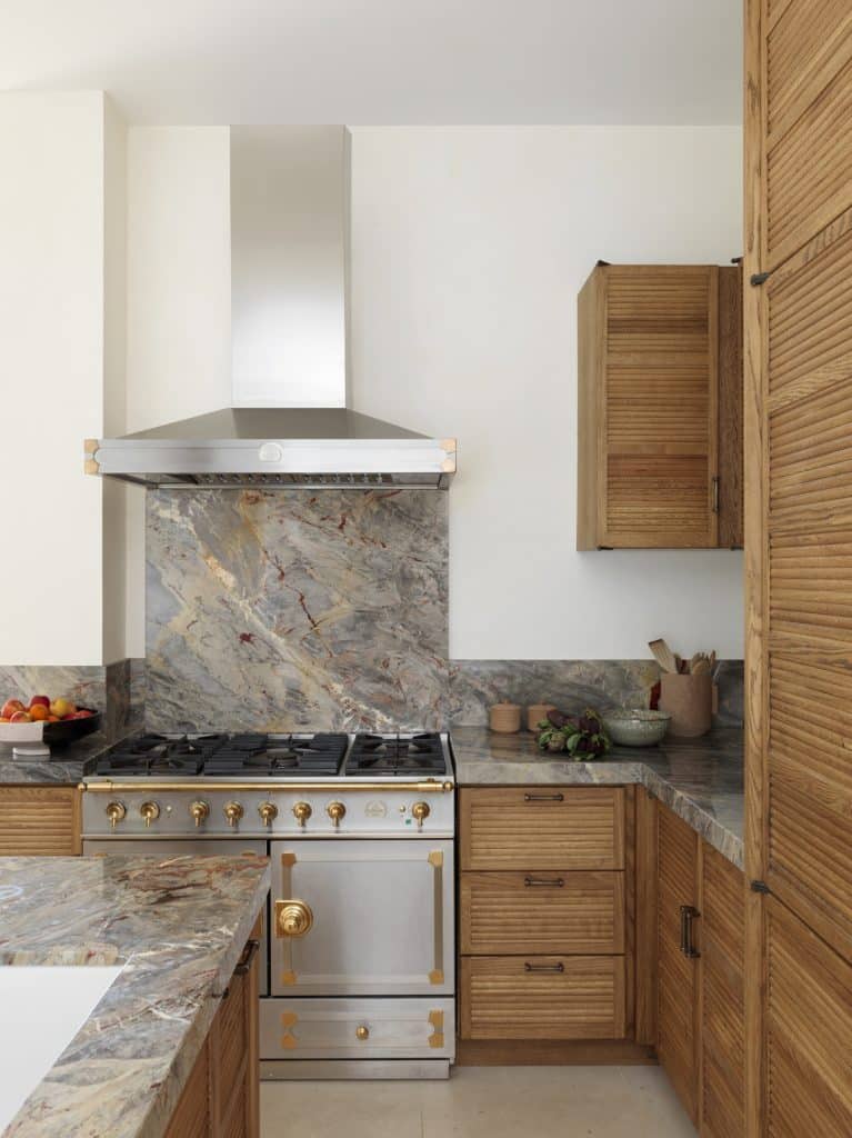
Linked to the family room via a large window, the kitchen offers a striking chromatic contrast. In the section used for cooking and food preparation, González deployed a subdued palette of grays and browns, using bright greens and reds in the breakfast niche. “I often like to bring in an unexpected touch of color,” she says, “to shake things up.”
For the cabinets, she asked the English company Devol to customize one of its collections, facing the doors with horizontal wooden strips reminiscent of bamboo. “They give a colonial feel that I like,” she explains. She selected a French marble called Brèche de Bénou for the countertops and had a La Cornue range, a classic of Gallic design, installed for cooking.
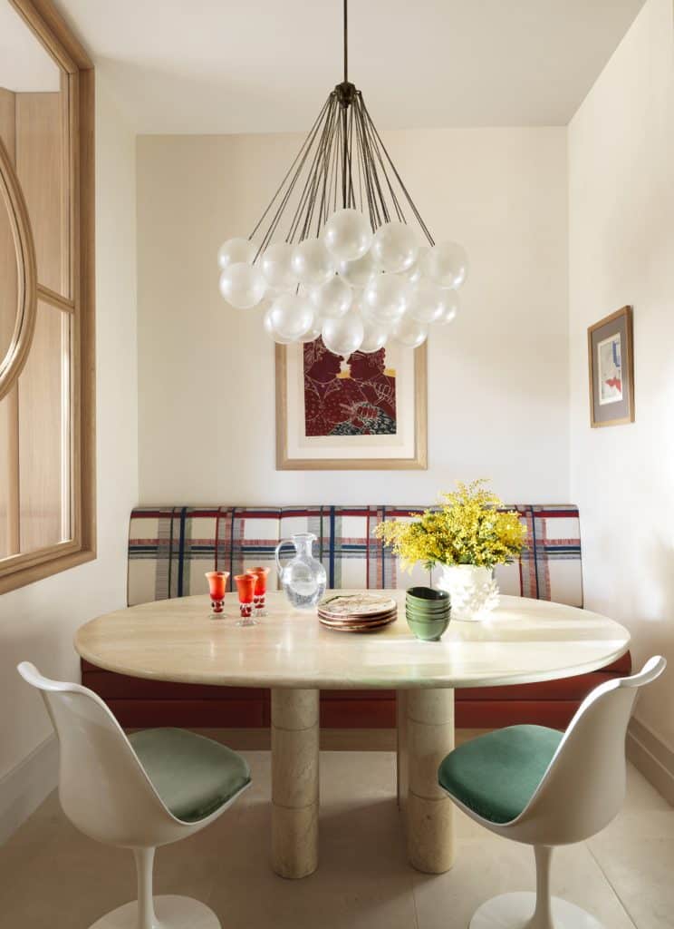
The more playful breakfast niche features a Cloud chandelier from APPARATUS (“a future classic”) and a pair of EERO SAARINEN’S ICONIC TULIP CHAIRS, drawn up to a 1970s travertine table on the other side of which is a banquette upholstered in an HERMÈS fabric and leather. A couple of works by the Greek artist ALEKOS FASSIANOS grace the walls.
“I never buy things just because they are by a certain designer or artist, but simply because they are right for a certain spot,” notes González. “It requires a lot of research, which is why I spend my evenings on 1stDibs and my weekends at the Paris flea market.”
Main Bedroom
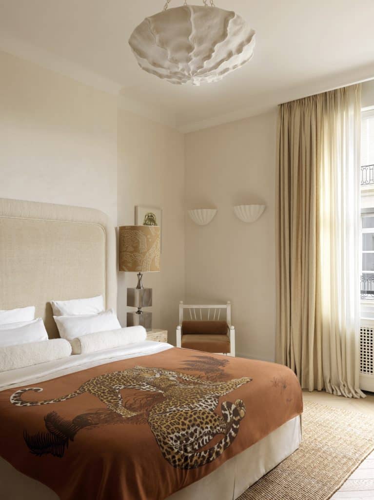
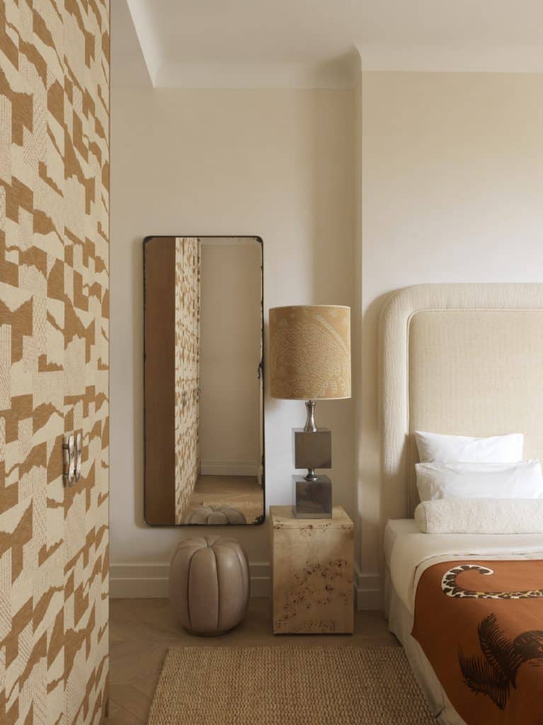
“I really wanted the bedroom to be extremely soft and peaceful — like a floating cloud,” says González. “But at one point, I couldn’t help myself and had to add something.” That something was an arresting beige-and-tan Larsen fabric with a deconstructed geometric pattern, which she used to clad the wardrobe doors.
Because of the generous ceiling height, she opted for an imposing headboard, upholstered in a velvet from Bruder & Co. “I thought that would help to anchor the room,” she explains. Additional texture is provided by a natural bulrush rug from Nobilis, a Soho Home leather ottoman and burlwood tables by ROSE UNIACKE.
Main Bathroom
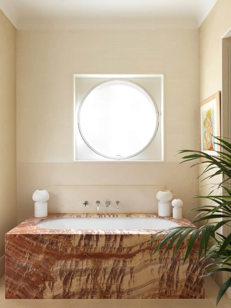
“The whole room is focused around an incredible porthole window,” says González, referring to a defining feature of the building’s original architecture. In front of that window stands a tub with a brown and cream onyx surround, on which are placed three Natural Light candleholders from her collection, created in collaboration with the Paris-based ceramist François Roger.
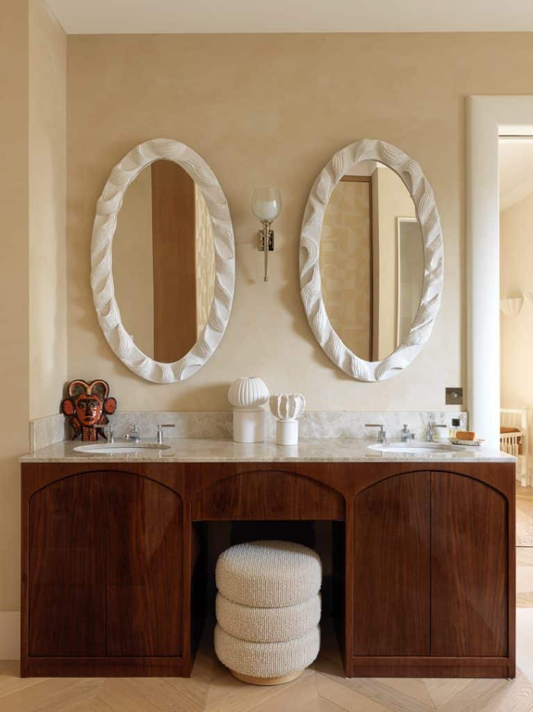
The rest of the space was conceived for functions other than simple ablutions. “It’s quite a large room,” remarks González, “so I thought of it more as a boudoir. That’s why there is a parquet floor and also why I designed the vanity more like a dressing table, with varnished walnut wood, arched forms and a spot for a stool.”
She had that piece — the BABYLONE STOOL from her collection — covered in a bouclette fabric from Métaphores. The MAISON LELEU sconce and the African mask nod to the Art Deco aesthetic, while the plaster mirror frames (another Roger collaboration) remind González of braided hair.
Children’s Bedroom
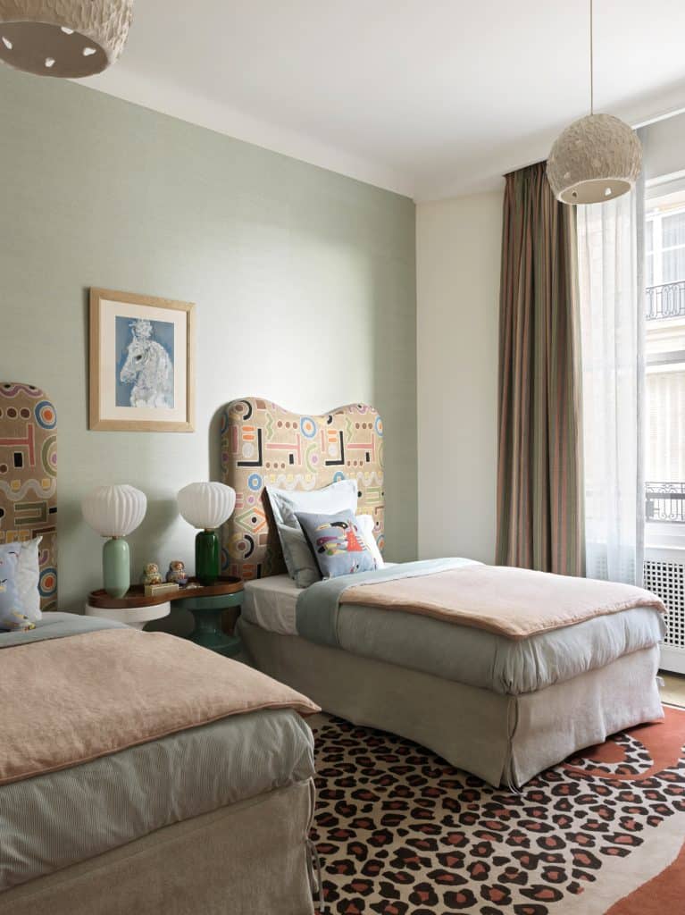
“I didn’t want to create a typical kids’ room, with stars on the ceiling and robots,” says González. “My idea was more for an artistic, colorful environment that would inspire the kids’ creativity.”
That artistry is epitomized by the painterly Amazonia fabric from Clarence House on the headboard and the decorative pillows with designs by JOAN MIRÓ resting against them. (The latter are from Pansu, which has obtained the license to reproduce numerous well-known museum works on homegoods.)
The leopard-print Marguerite Le Maire rug and INDIA MAHDAVI’s lollipop-like lamps and shiny lacquered tables provide a dose of fun and boldness, while celadon straw paper from Nobilis adds a touch of texture. “Straw has Art Deco connotations,” says González. “I use it a lot.”
Children’s Bathroom
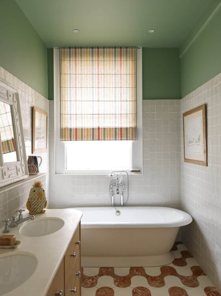
One of González’s signatures is her effortless mixing of disparate elements. “For me, doing so brings a relaxed, laid-back feel to an interior,” she explains.
In this bathroom, she juxtaposed wavy floor tiles from Fornace Brioni and a striped blind by the London-based designer Beate Heuman with a tub she terms “English-style” and a plaster mirror frame whose motifs recall hieroglyphs. Another thing she is not afraid of is placing artworks on top of ceramic wall tiles — as she did here with two pieces by Marko Čelebonović, which face off across the tub.
Guest Bedroom
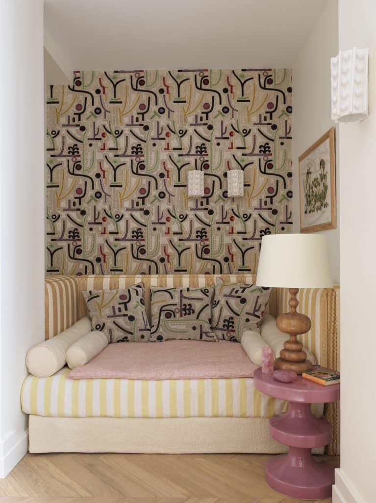
Clarence House textiles make another appearance in the guest bedroom, where González clad one wall in the firm’s profusely patterned Velours Klee fabric. “For me, there’s something quite Art Deco to its forms,” she says. “What I like about the style is the shapes more than its sometimes austere use of materials. My work is always full of joie de vivre.”
That is evident in the striped fabrics and the 1970s lamp, which could have been made to sit on Mahdavi’s candy-pink Bishop table. González has long been a fan of the latter. “It’s a fun and timeless design, and it works really well in small spaces,” she effuses. “For me, it embodies the kind of easygoing chic I try to inject into all my projects.”
0 comments


